Rows: 344
Columns: 8
$ species <fct> Adelie, Adelie, Adelie, Adelie, Adelie, Adelie, Adel…
$ island <fct> Torgersen, Torgersen, Torgersen, Torgersen, Torgerse…
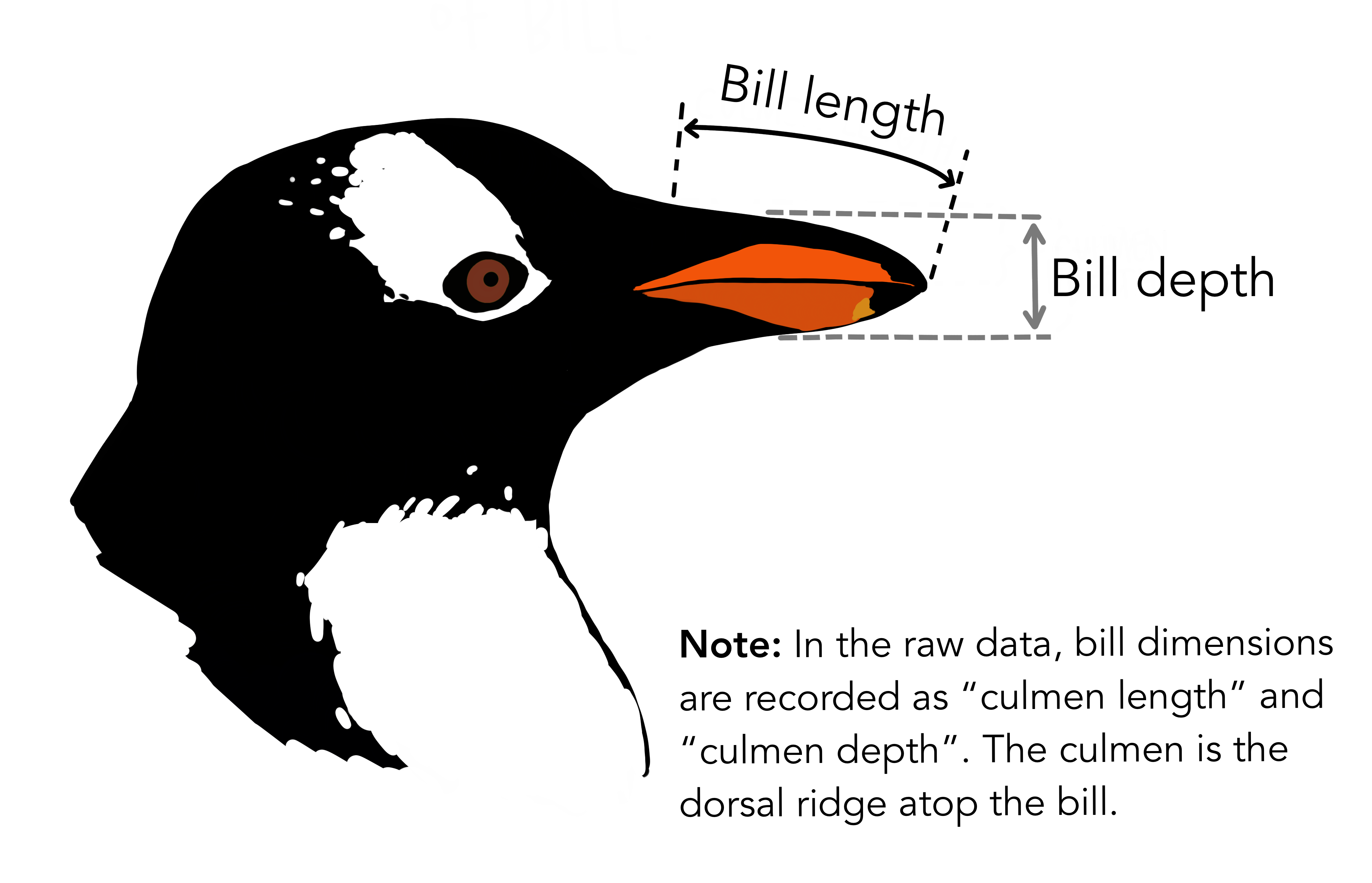
$ bill_length_mm <dbl> 39.1, 39.5, 40.3, NA, 36.7, 39.3, 38.9, 39.2, 34.1, …
$ bill_depth_mm <dbl> 18.7, 17.4, 18.0, NA, 19.3, 20.6, 17.8, 19.6, 18.1, …
$ flipper_length_mm <int> 181, 186, 195, NA, 193, 190, 181, 195, 193, 190, 186…
$ body_mass_g <int> 3750, 3800, 3250, NA, 3450, 3650, 3625, 4675, 3475, …
$ sex <fct> male, female, female, NA, female, male, female, male…
$ year <int> 2007, 2007, 2007, 2007, 2007, 2007, 2007, 2007, 2007…DATA VISUALIZATION
USING GGPLOT
2 Days Data Science Workshop at Institute of Development Studies, Jaipur (ICSSR)
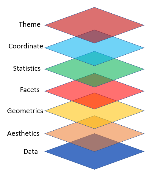
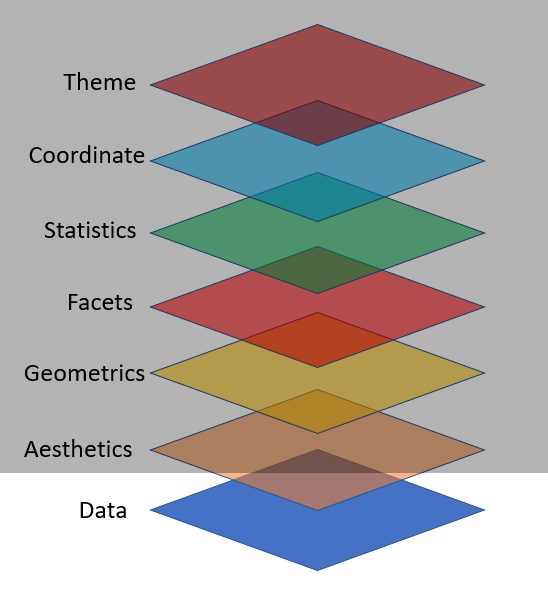
Grammar of Graphics
![]()
ggplot2 Layers
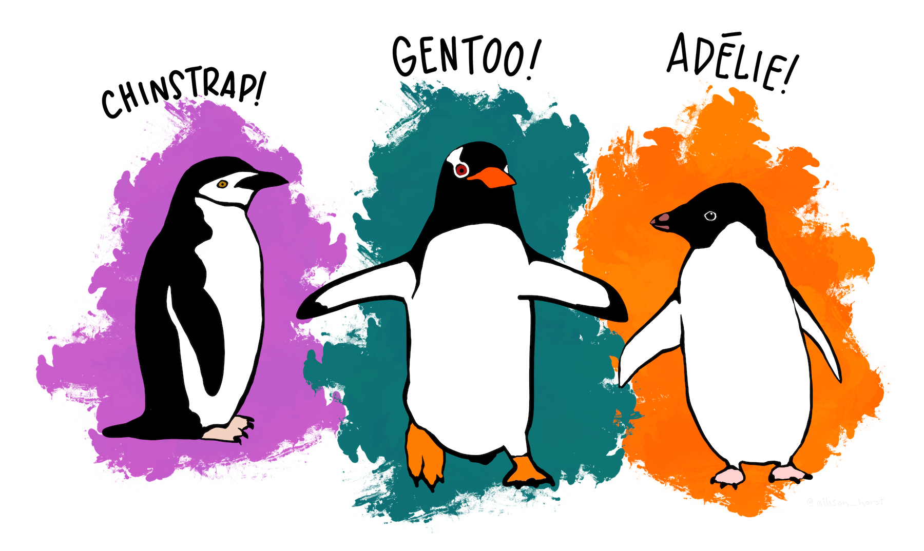
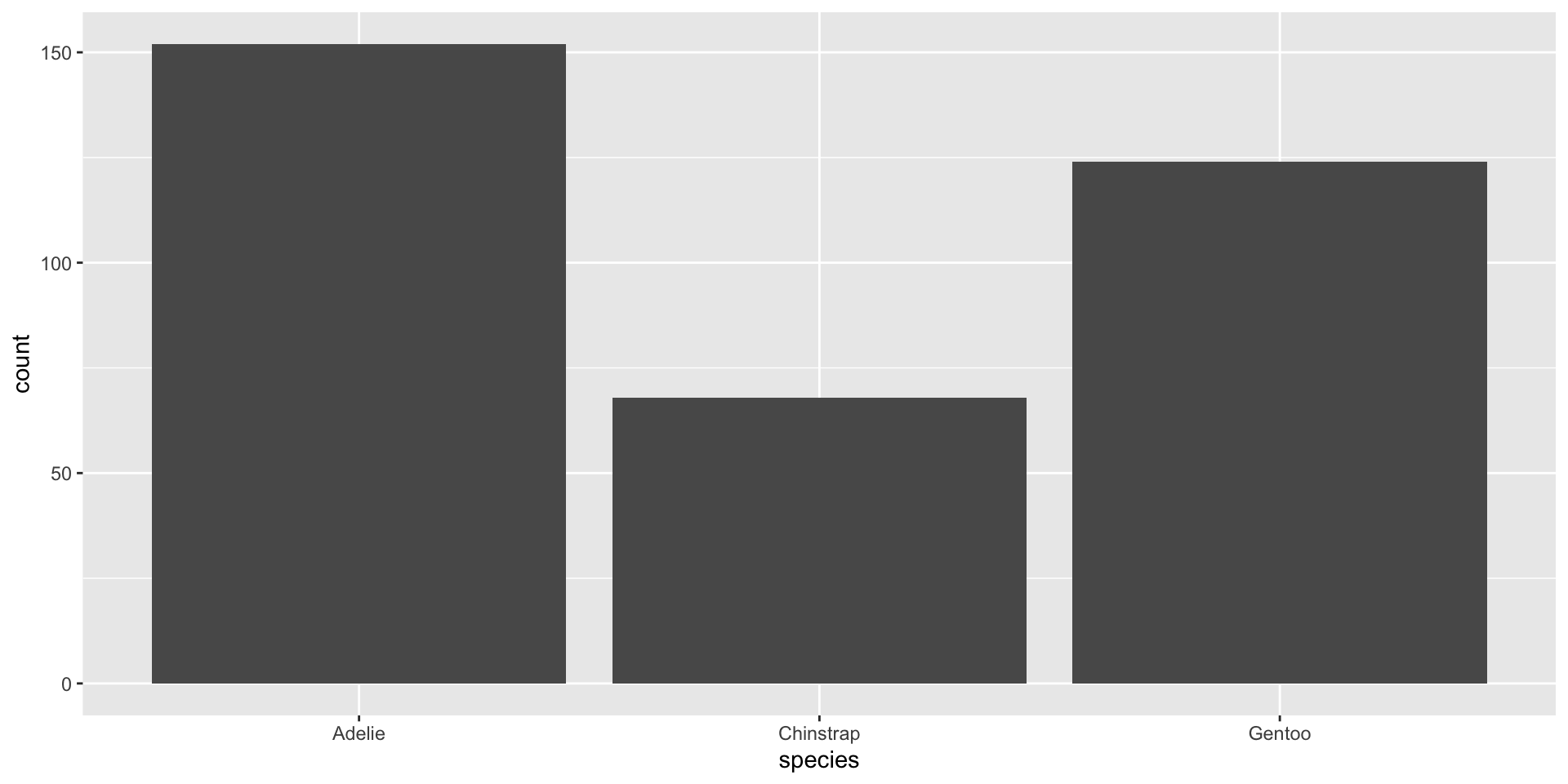
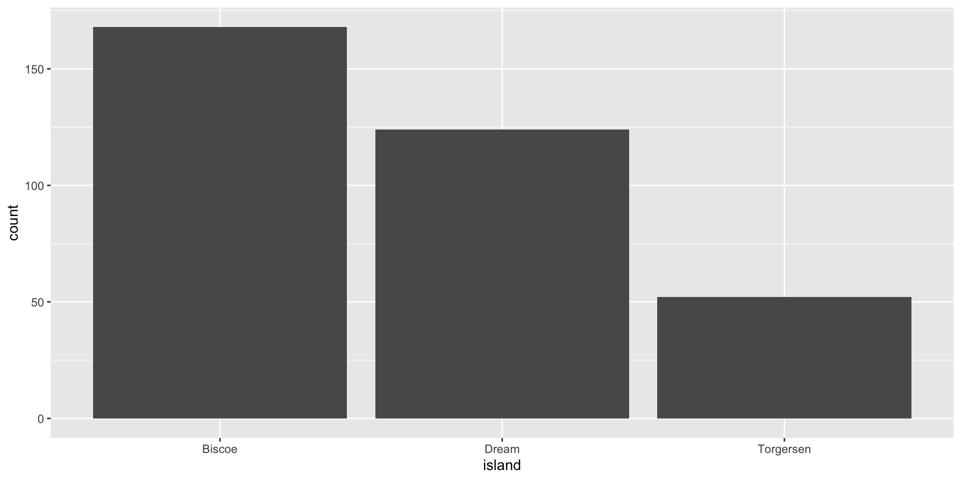
Data: penguins
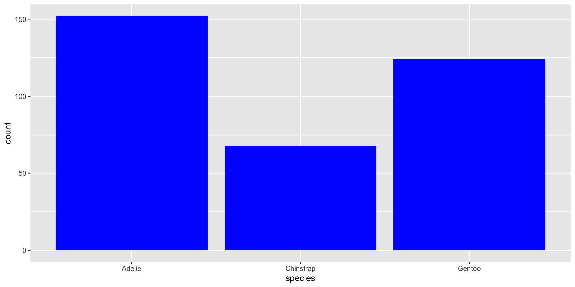
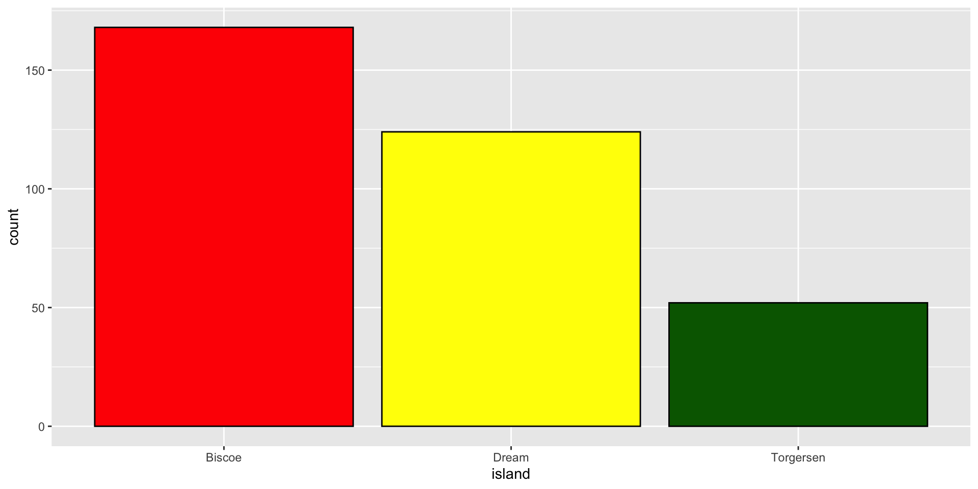
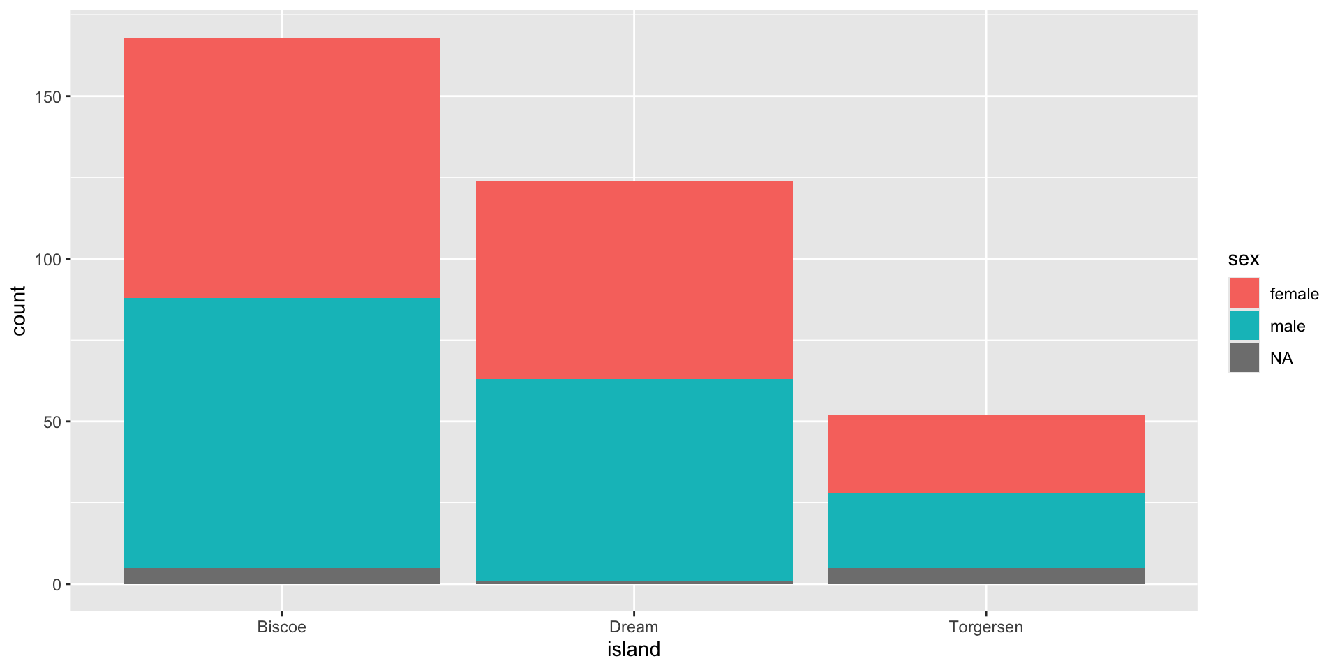
Live on three island: Biscoe, Dream, & Torgersen.
Import Data

Map Variables Aesthetics

Add Geometric Shapes

🧠 YOUR TURN
05:00
“Fill” Color
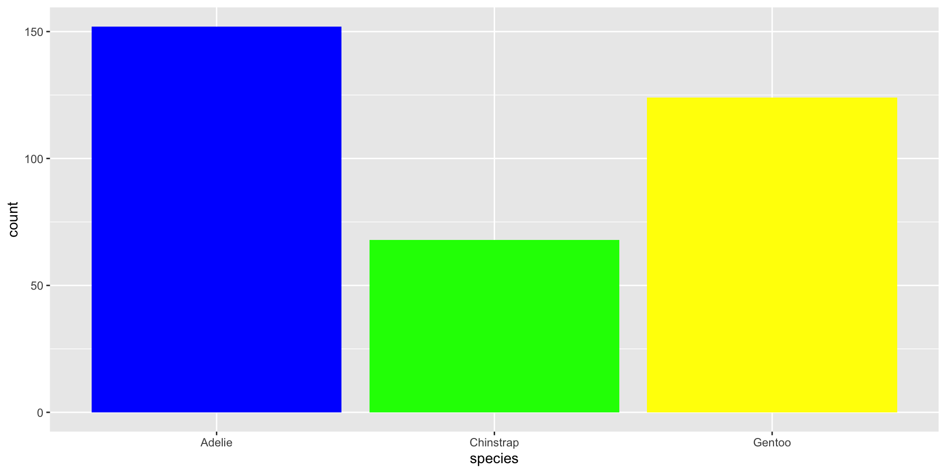
“Fill” Colors
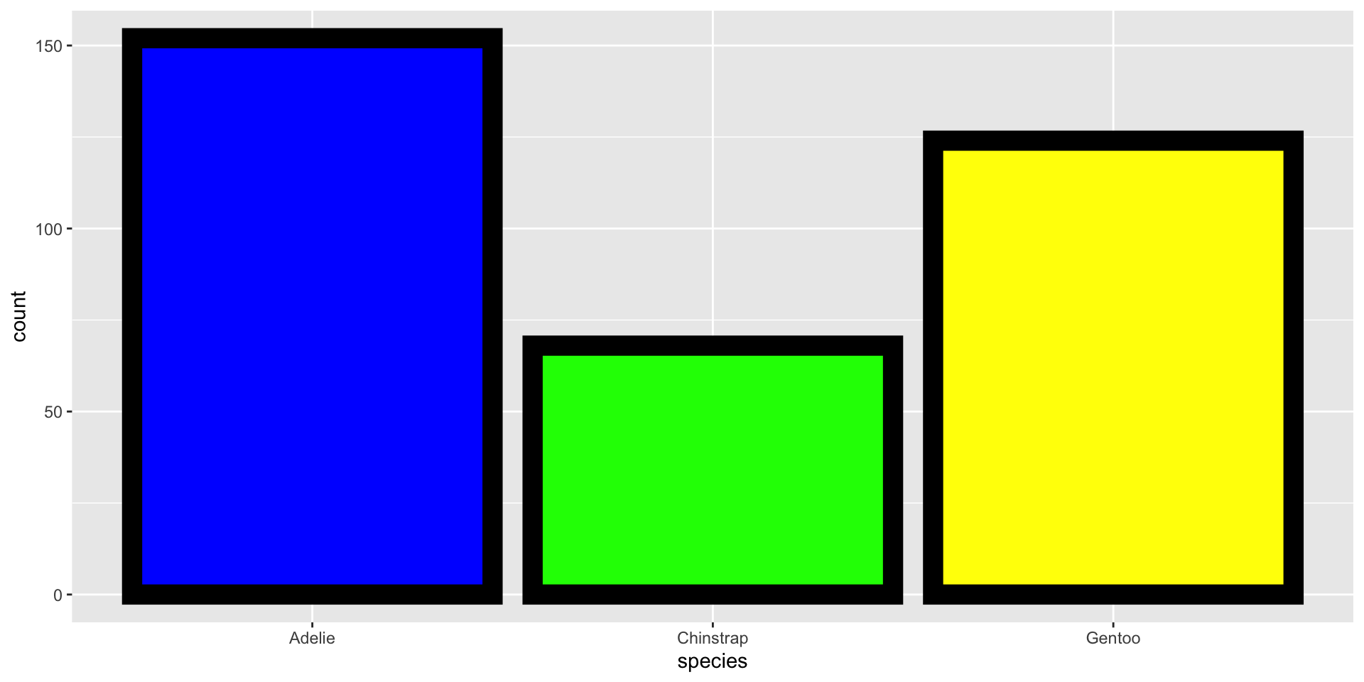
“Fill” & “Color” Colors
🧠 YOUR TURN
05:00
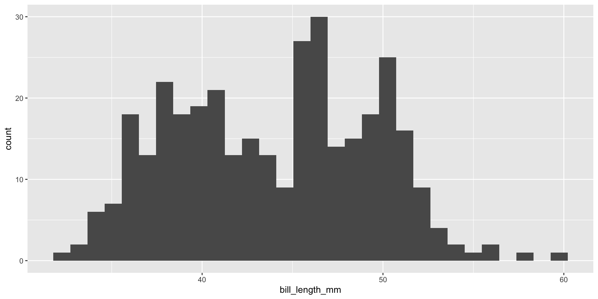
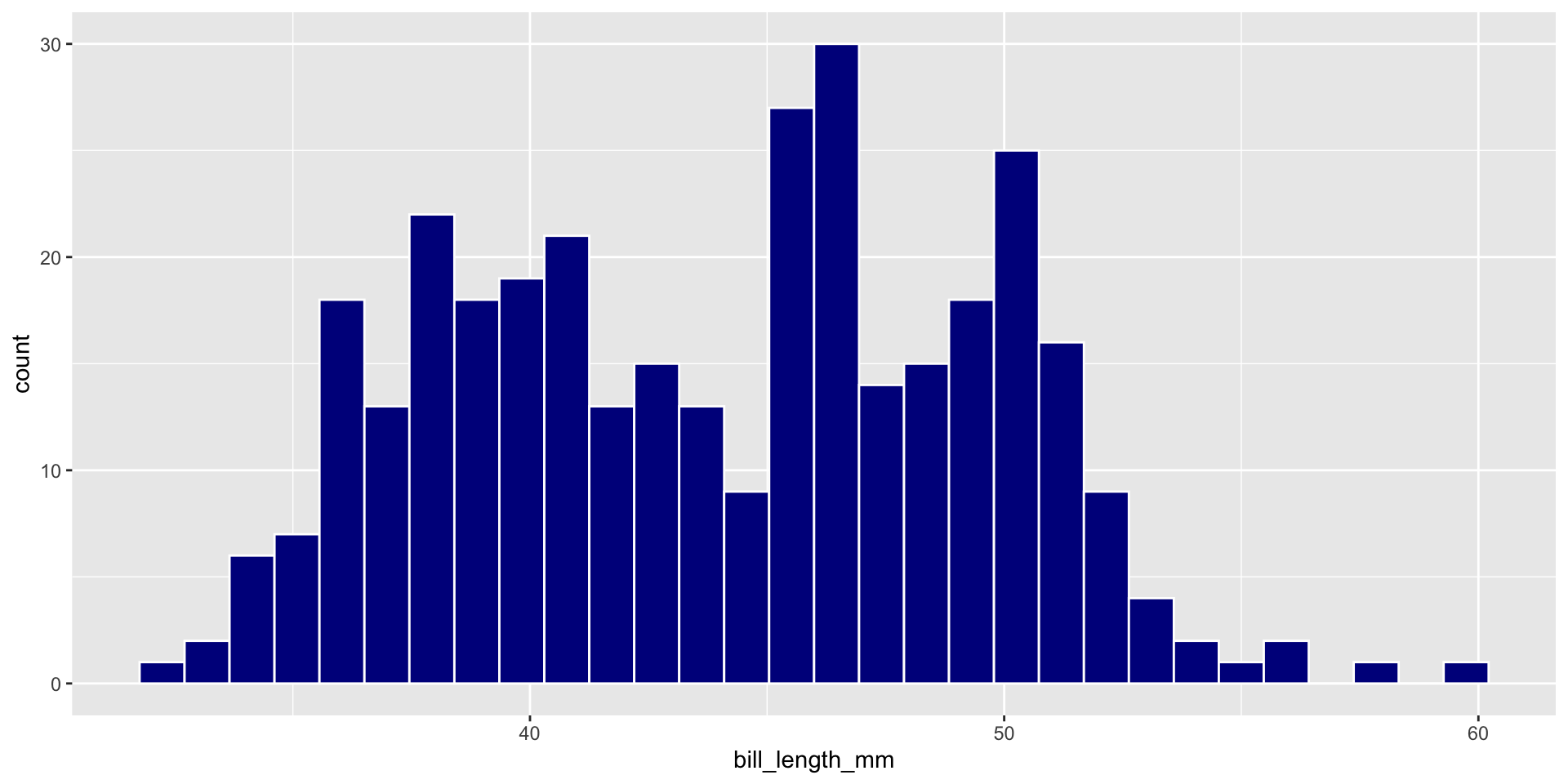
Plot A Continuous Variable
🧠 YOUR TURN
05:00
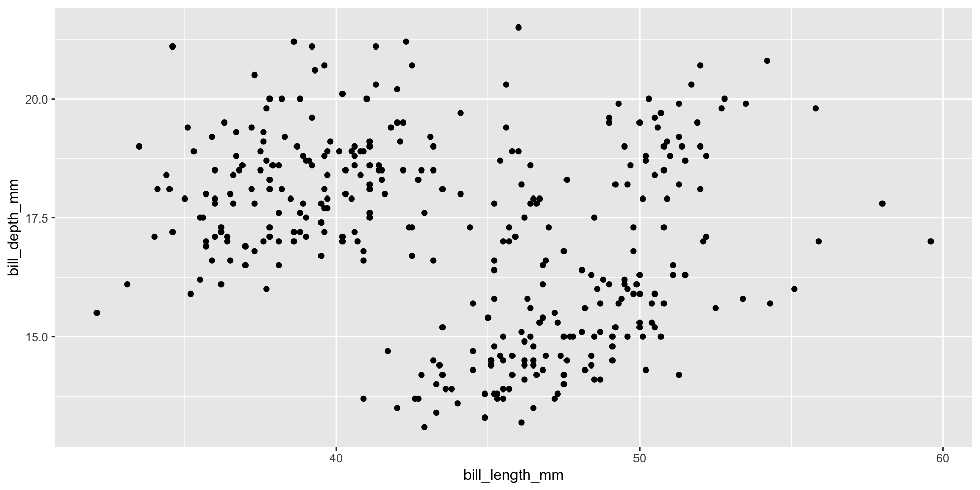
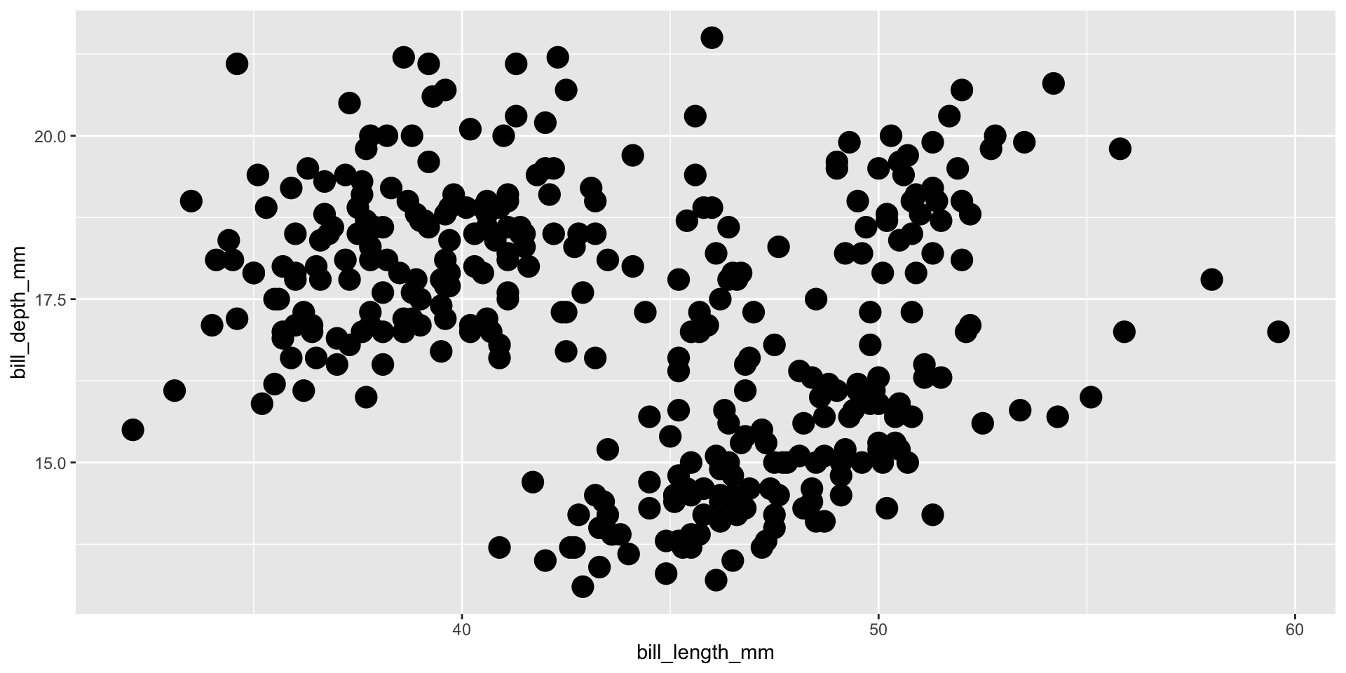
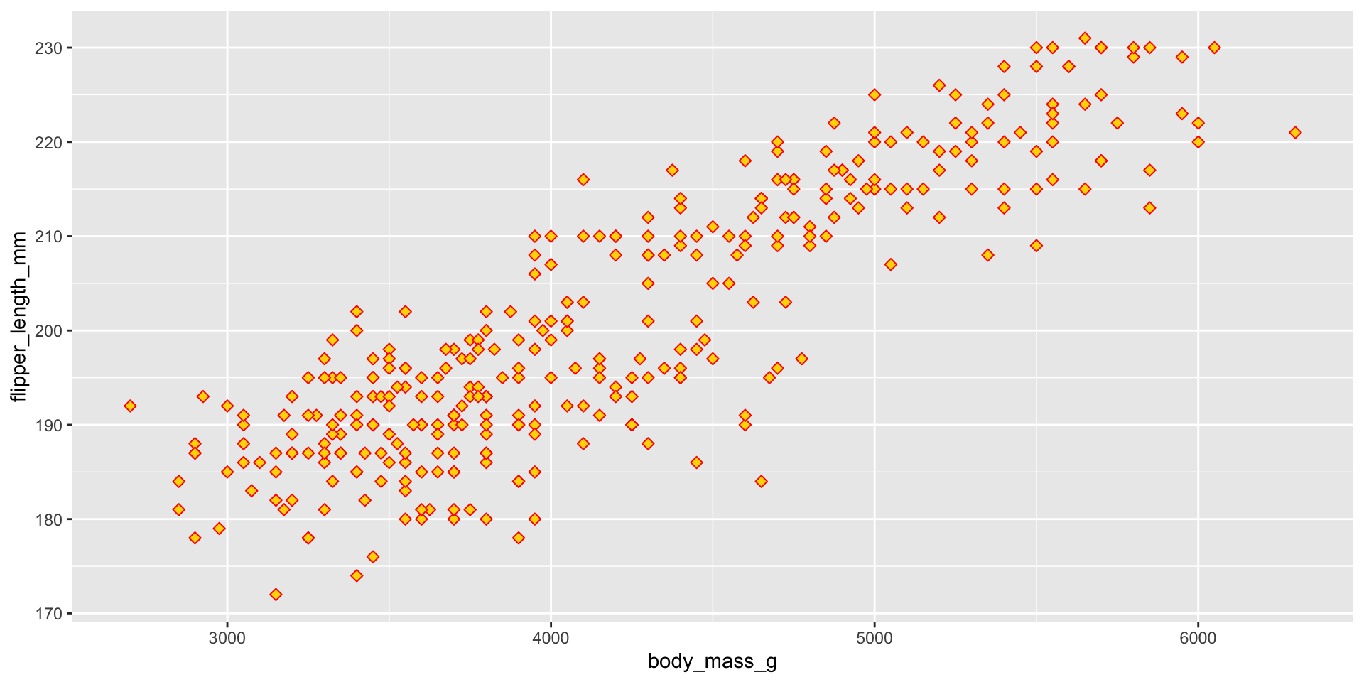
Two Continuous Variables
Geom Size
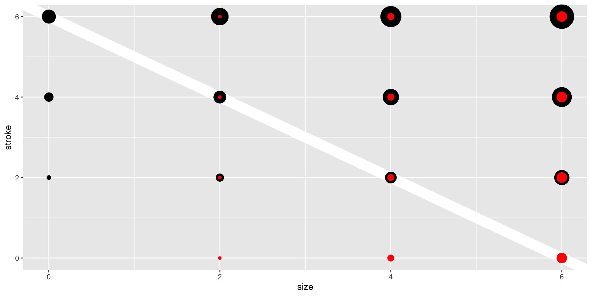
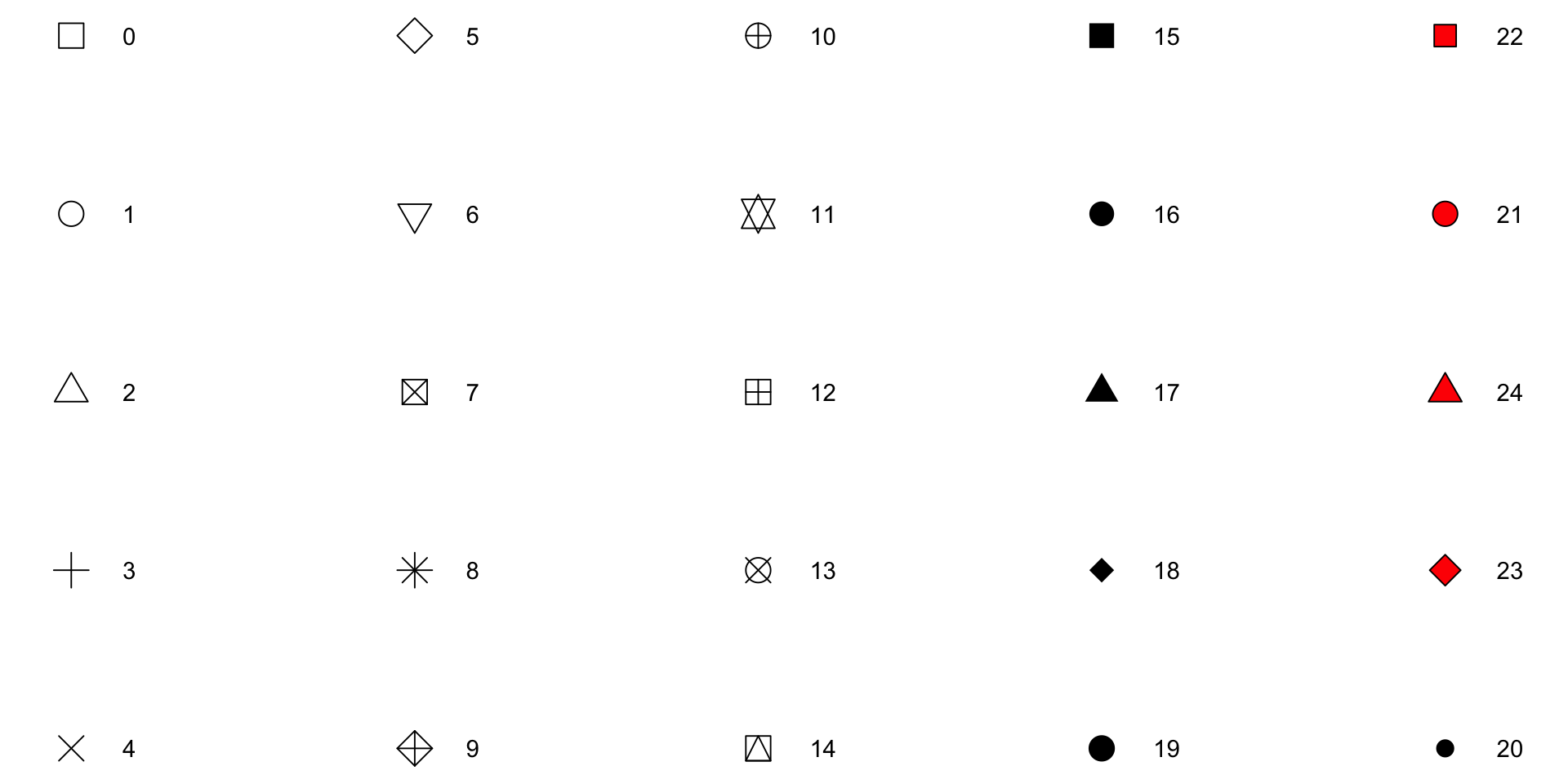
Geom Shape

🧠 YOUR TURN
05:00
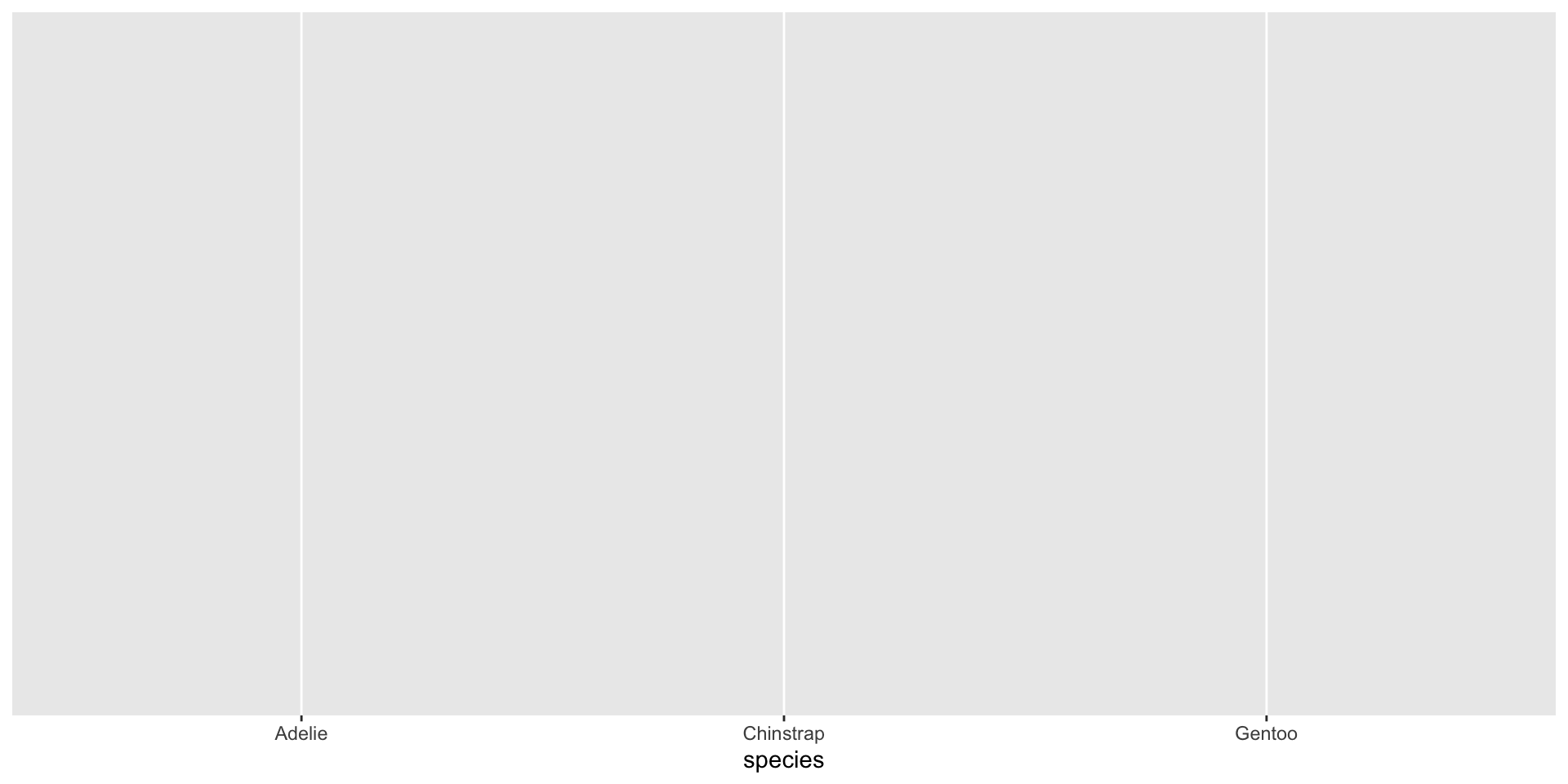
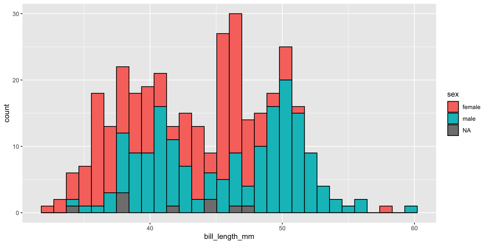
Plot Two Factors/Categorical
Plot a Continuous and Factor
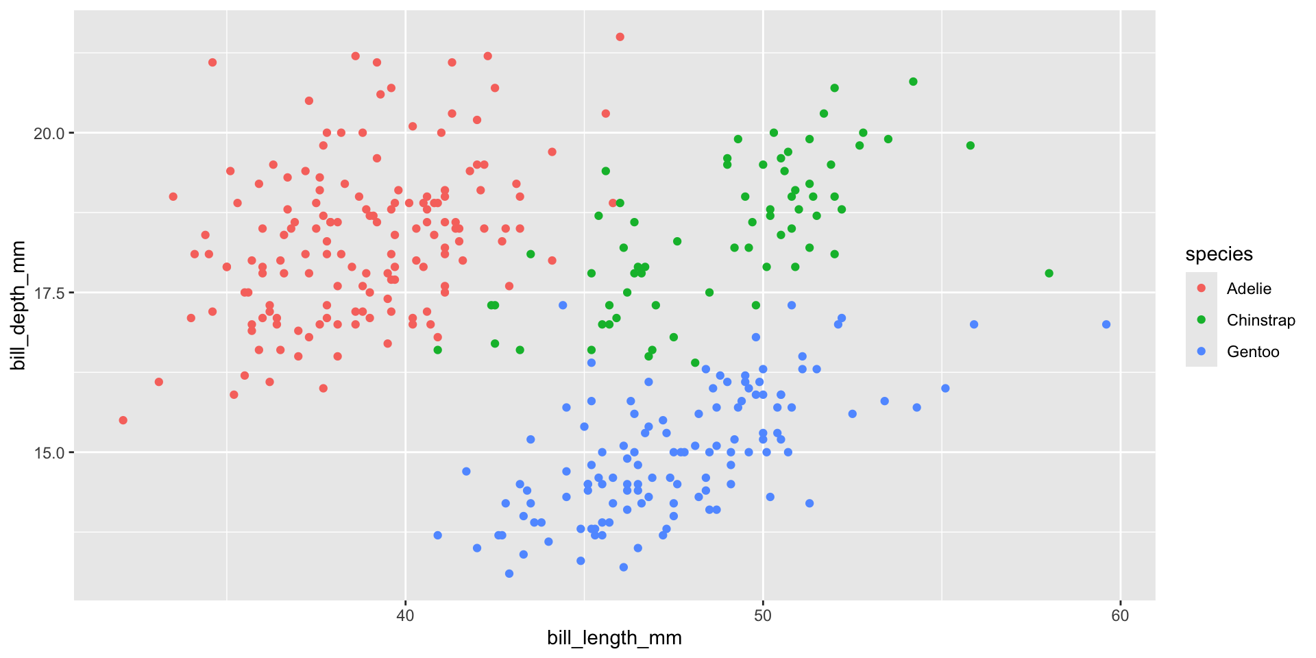
Two Continuous & a Factor
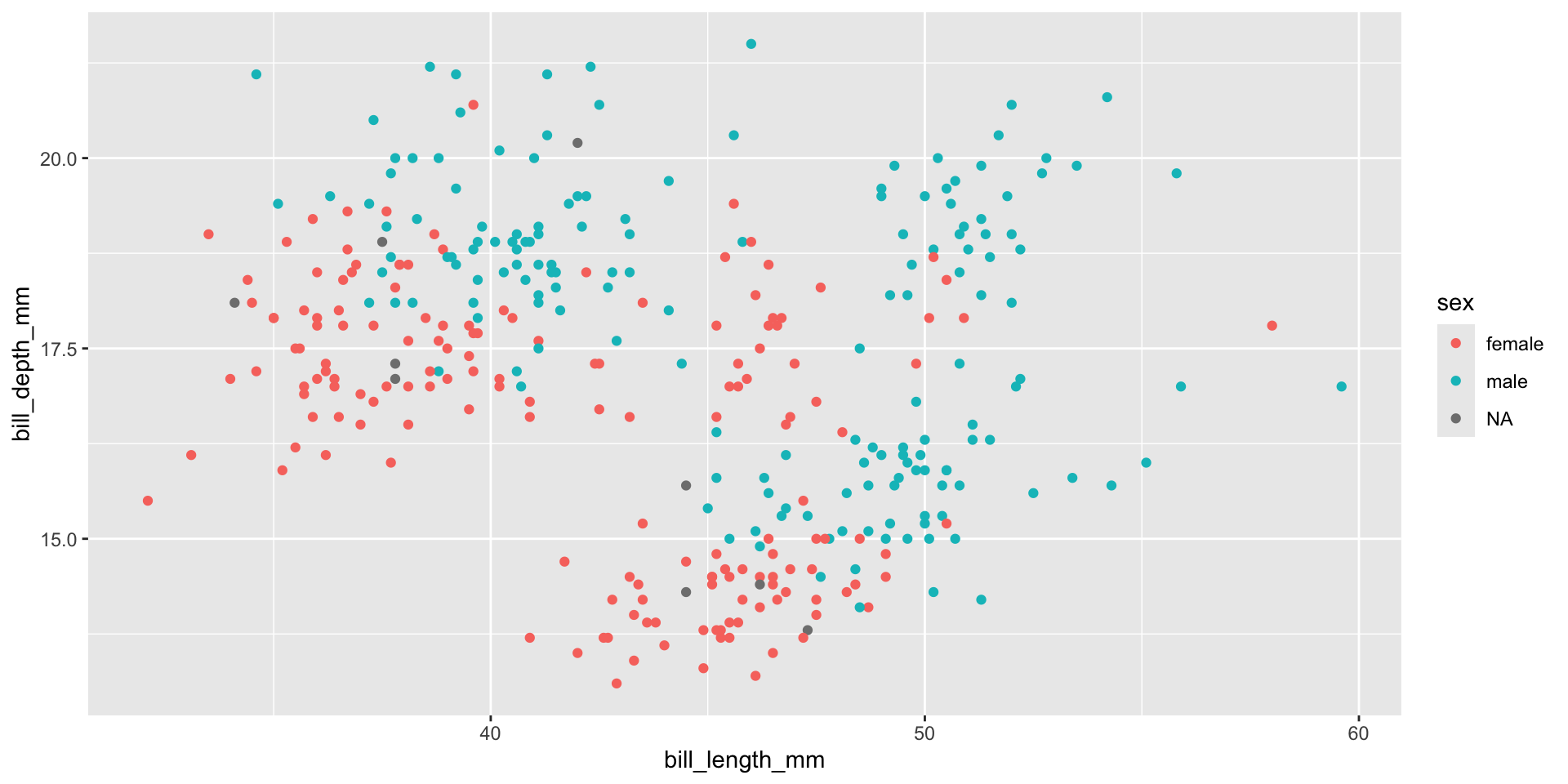
Two Continuous & a Factor
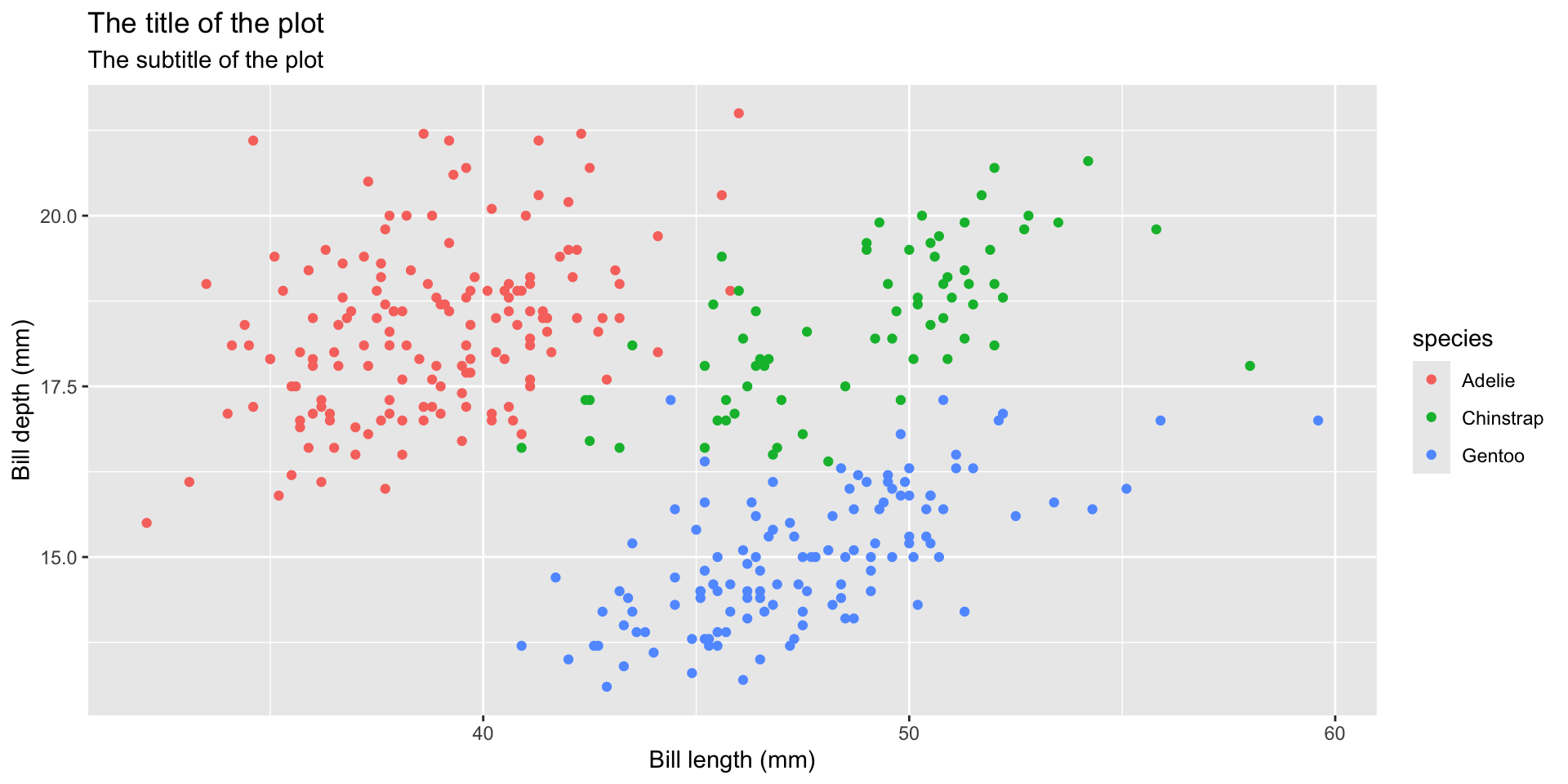
Write Labels
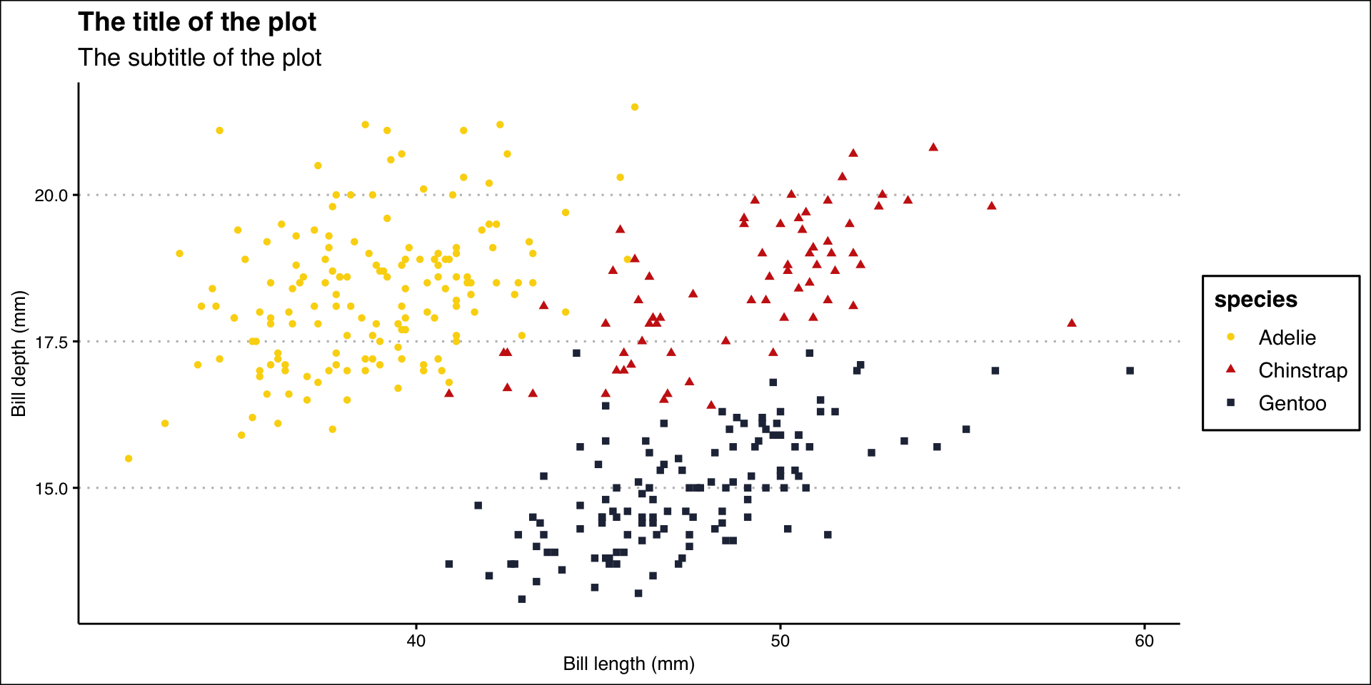
Title of the plot
Subtitle of the plot with more information
Title of the x-axis
Title of the y-axis
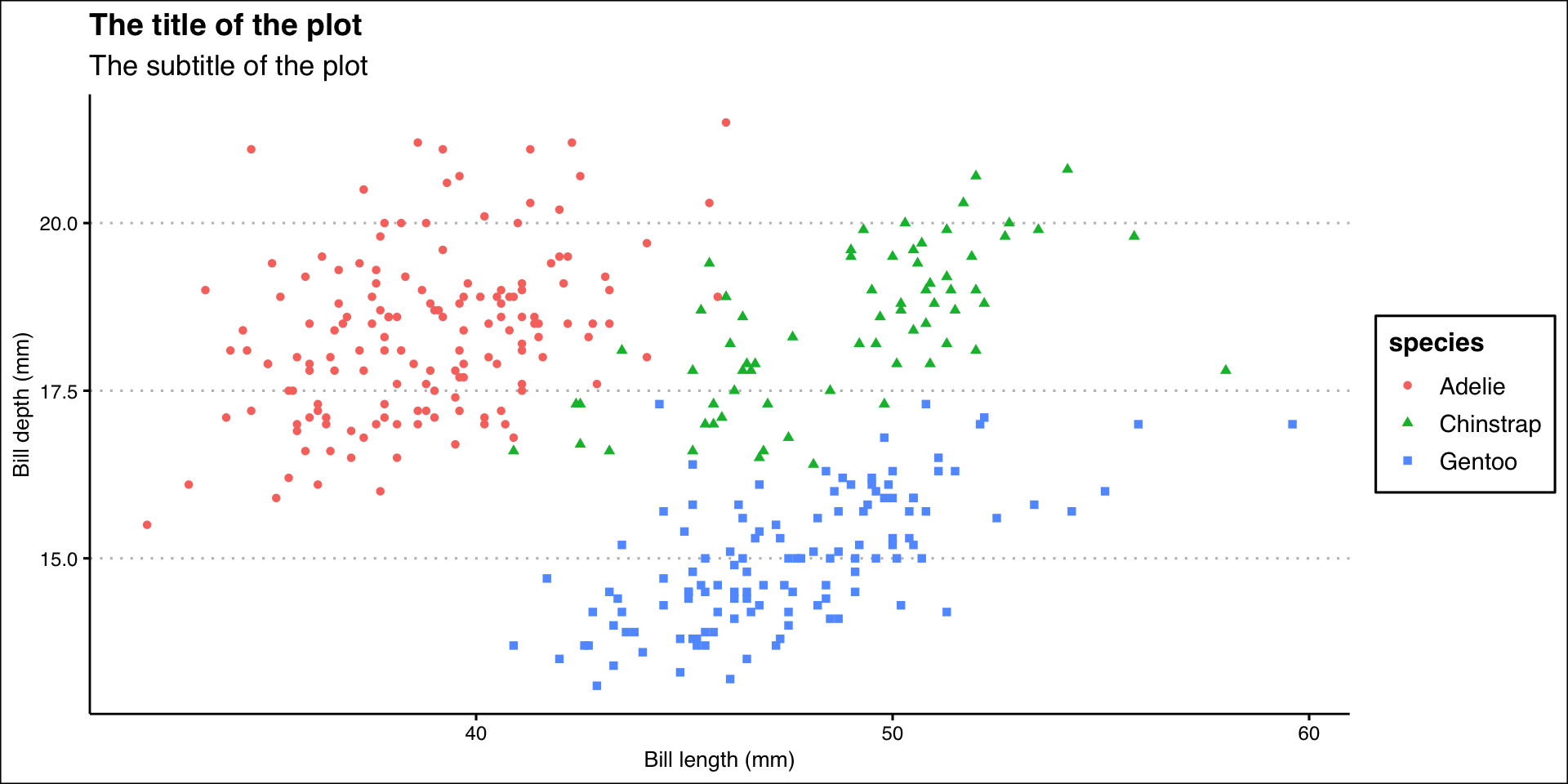
Different Shapes
Each level of the factor/category can be shown using a different shape of different color.
GGThemes
Additional themes, scales, and geoms for ggplot2
Source: Learn more about ggthemes & ggthemes tutorial
Theme Solarized
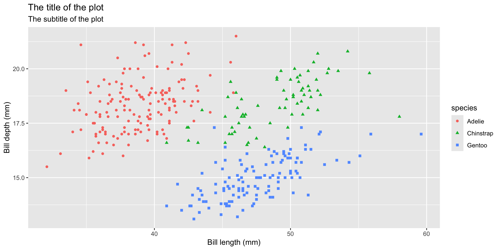
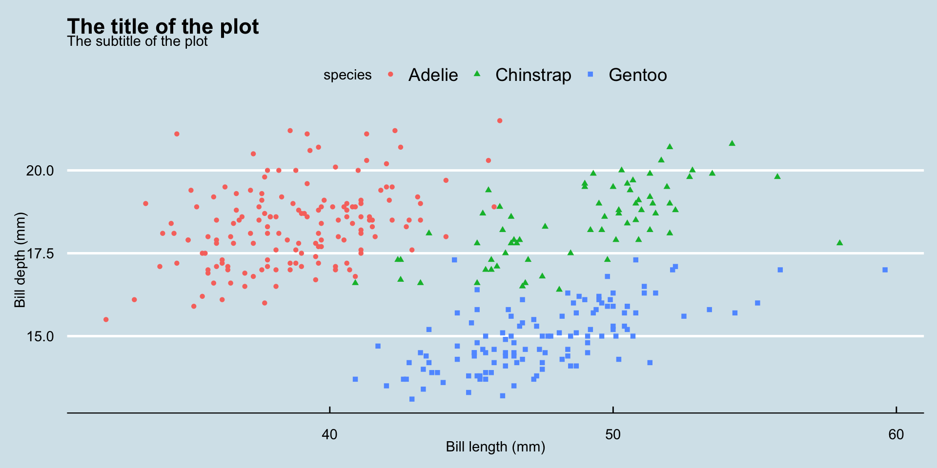
billplot <- ggplot(data = penguins,
mapping = aes(x = bill_length_mm, y = bill_depth_mm)) +
geom_point(aes(color = species, shape = species)) +
labs(
title = "The title of the plot",
subtitle = "The subtitle of the plot",
x = "Bill length (mm)",
y = "Bill depth (mm)"
)
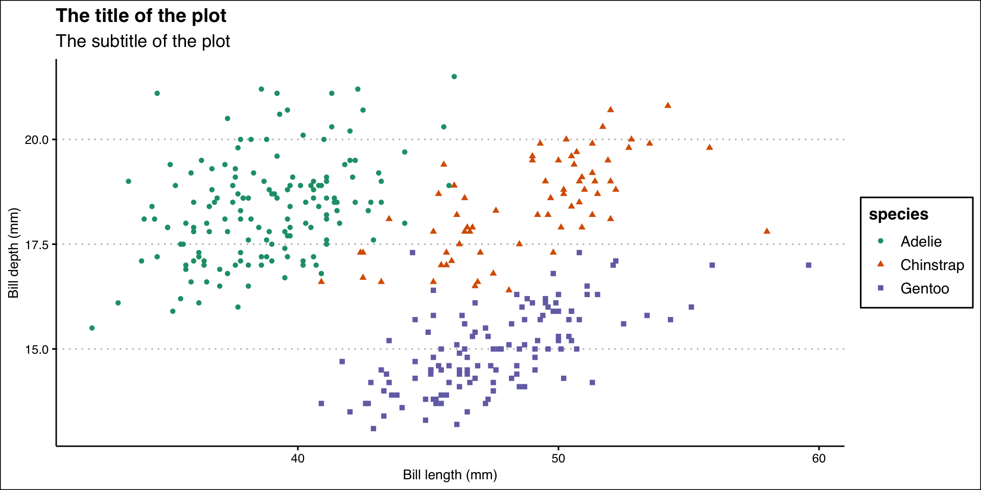
billplot + theme_solarized_2()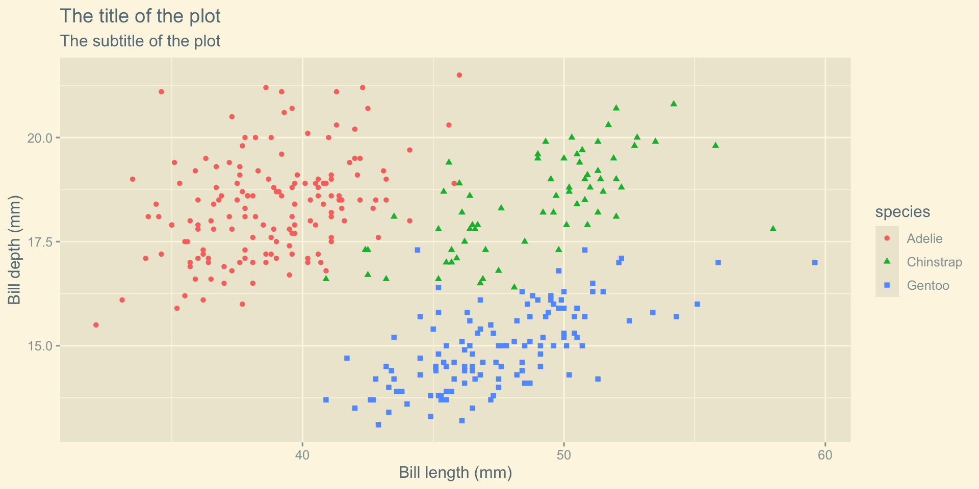
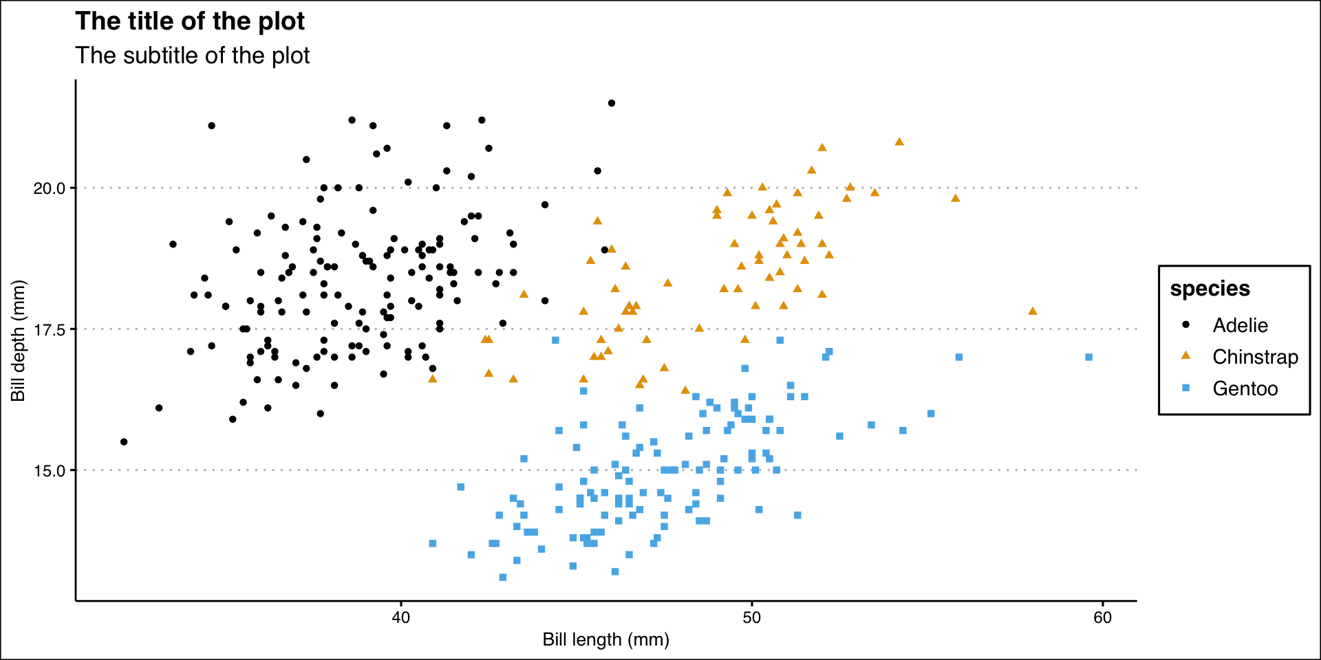
Theme Tufte
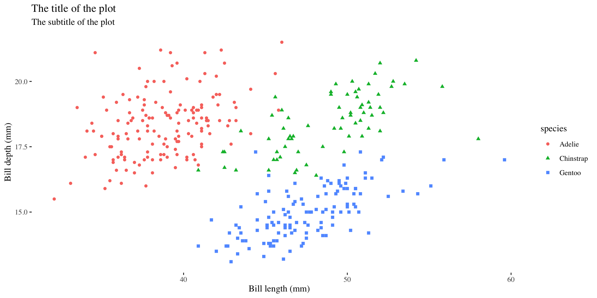
Theme Clean
🎨 Color Palette
Color Palette
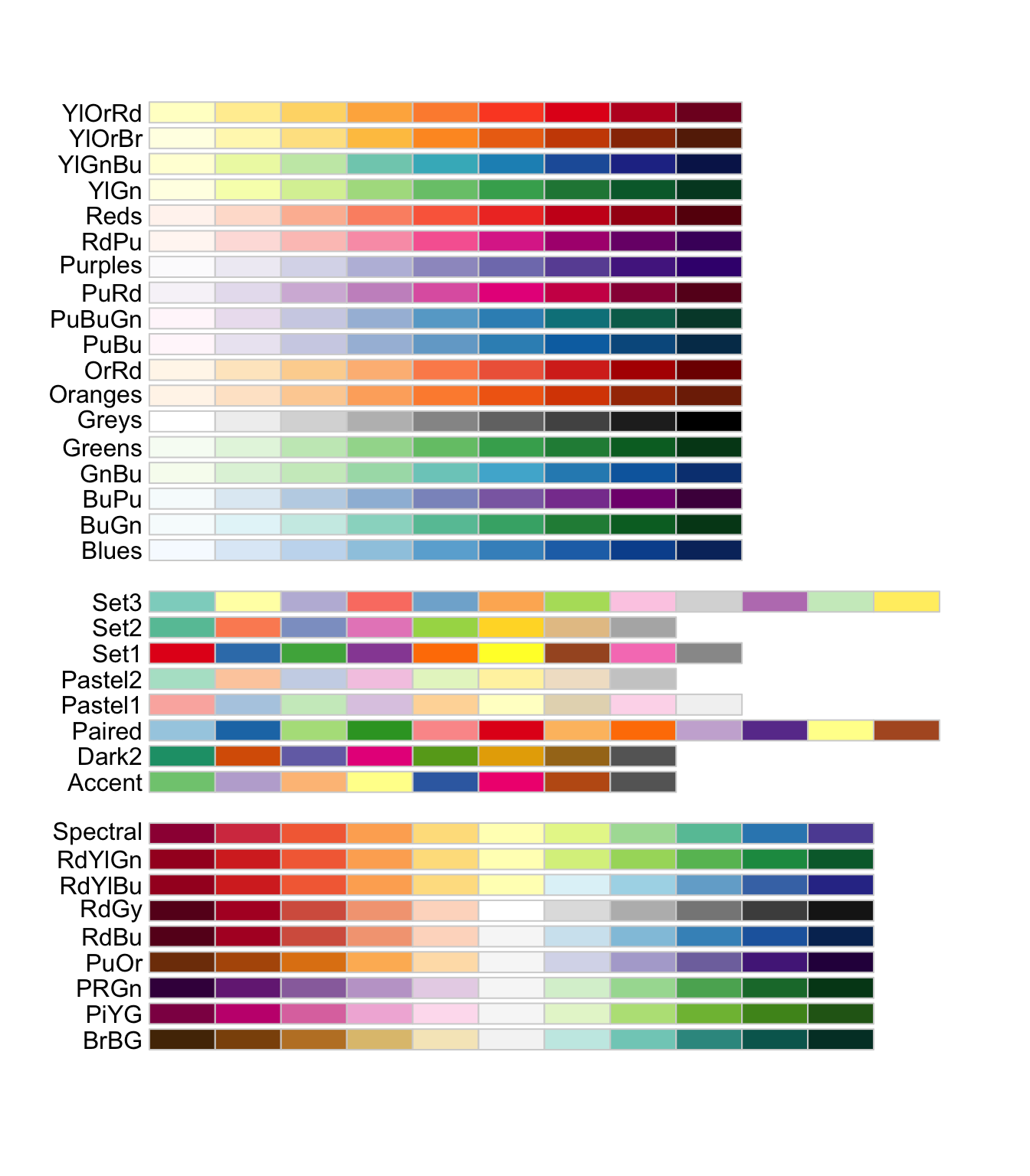
Color Palette RColorBrewer
Color Palette Wesanderson
[1] "BottleRocket1" "BottleRocket2" "Rushmore1"
[4] "Rushmore" "Royal1" "Royal2"
[7] "Zissou1" "Zissou1Continuous" "Darjeeling1"
[10] "Darjeeling2" "Chevalier1" "FantasticFox1"
[13] "Moonrise1" "Moonrise2" "Moonrise3"
[16] "Cavalcanti1" "GrandBudapest1" "GrandBudapest2"
[19] "IsleofDogs1" "IsleofDogs2" "FrenchDispatch"
[22] "AsteroidCity1" "AsteroidCity2" "AsteroidCity3" 
Export Plot
Export/save plot as pdf, jpg or png file.
ggplot(data = penguins,
       mapping = aes(x = bill_length_mm, y = bill_depth_mm)) +
  geom_point(aes(color = species, shape = species)) +
  labs(
    title = "The title of the plot",
    subtitle = "The subtitle of the plot",
    x = "Bill length (mm)",
    y = "Bill depth (mm)"
) +
theme_clean() +
scale_color_manual(values = wes_palette("BottleRocket2", n = 3))
ggsave("penguins-plot.pdf")